Chapter 8 The hydrologic cycle and precipitation
All of the earlier chapters of this book dealt with the behavior of water in different hydraulic systems, such as canals or pipes. Now we consider the bigger picture of where the water originates, and ultimately how we can estimate how much water is available for different uses, and how much excess (flood) water systems will need to be designed and built to accommodate.
The hydromisc package will need to be installed to access some of the data used below. If it is not installed, do so following the instructions on the github site for the package.
8.1 The hydrologic cycle
A fundamental concept is the hydrologic cycle, depicted in Figure 8.1.
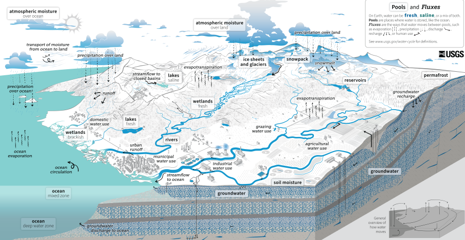
Figure 8.1: The hydrologic cycle, from the USGS
The primary variable in the hydrologic cycle from an engineering perspective is precipitation, since that is the source of the water used and managed in engineered systems. When precipitation hits the land surface it can take many paths: principally it may infiltrate into the soil or form runoff. Water collected in ponds or depressions may evaporate, and additional water may evaporate from the soil surface or be drawn from the soil by vegetation to be transpired. In a simplified way, the water budget may be expressed as Equation (8.1). \[\begin{equation} Q = P - E + \Delta S \tag{8.1} \end{equation}\] where Q is outflow (as in streamflow volume), P is precipitation, E is evapotranspiration, and ΔS is the change in storage (in snowpack, the soil or groundwater). Over long time periods, ΔS becomes very small compared to the other terms, so for what is called ‘climatological’ periods (often 30-year averages) the water budget can simplified to Equation (8.2) \[\begin{equation} Q = P - E \tag{8.2} \end{equation}\] All variables must have the same units, so typically Q is expressed as a depth of water (or runoff) over the contributing drainage area. Example 8.1 shows a demonstration of a simple water budget over a basin.
Example 8.1 Using only the generally available data P, T (air temperature), and Q, assess the water budget for the watershed contributing flow to the USGS stream gauge 11169500, Saratoga Creek, CA.
First considering Q, streamflow for USGS stream gauges can be directly downloaded from the USGS either from their website or using the R package dataRetrieval. However, for many sites those streamflow observations will include effects of upstream impoundments (dams) or diversions, so will not represent the response of the watershed to precipitation. Another option is to use estimates of “naturalized” streamflows, which have been calculated by the USGS as part of its National Hydrographic Dataset (NHD) products. The R package nhdplusTools provides one way to access this. The packages sf and terra will be useful for manipulating some spatial objects created along the way.
First the gauge and contributing basin are downloaded using nhdplusTools, and the river reach flowlines are identified.
library(nhdplusTools)
#> Warning: package 'nhdplusTools' was built under R version 4.4.3

nwissite <- list(featureSource = "nwissite", featureID = "USGS-11169500")

# Retrieve gauge location and basin boundary objects
gauge <- get_nldi_feature(nwissite)
basin <- get_nldi_basin(nwissite)
nldi_feature <- list(featureSource = "comid", featureID = as.integer(gauge$comid)[1])
flowline_nldi <- navigate_nldi(nldi_feature,
                               mode = "upstreamTributaries",
                               distance_km = 1000)
With the basin and reaches defined, the nhdplus data for the basin contributing to the outlet gauge can be downloaded as a geopackage (.gpkg file). Here the current working directory is set as where the file will be written.
# Download the geopackage to the working directory
output_file_download <- file.path(getwd(), "subset_download.gpkg")

nhd_subset <-subset_nhdplus(comids = as.integer(flowline_nldi$UT$nhdplus_comid),
                             output_file = output_file_download,
                             flowline_only = FALSE,
                             nhdplus_data = "download",
                             return_data = TRUE, overwrite = TRUE)
flowline <- nhd_subset$NHDFlowline_Network
In the example above, nhd_subset has four layers of sf objects, one of which is the NHDFlowline layer that is used in what follows. What is displayed in Figure 8.2 is a static image produced using the mapview function mapshot.
mapview::mapview(basin, legend=FALSE) +
  mapview::mapview(flowline, color = "cyan", col.regions = "white", lwd = 3, legend=FALSE) +
  mapview::mapview(gauge, color = "red", col.regions = "white", cex = 3, legend=FALSE)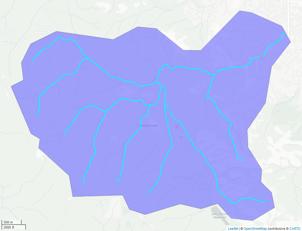
Figure 8.2: Watershed boundary and nhdplus stream network for USGS gauge 11169500.
In this example the flows with the prefix qc (representing the QCMA flows described in the NHDPlus User’s Guide) are extracted to represent naturalized flows. These are also converted to mm using the total basin drainage area and the number of days per month.
# Extract the data for only the outlet reach
outlet <- subset(flowline, flowline$comid == gauge$comid)
drainage_area_km2 <- outlet$totdasqkm
# 12 monthly flows for outlet - QC is natural flows adjusted using unimpaired gauges
df.flows <- dplyr::select(sf::st_drop_geometry(outlet), starts_with("qc_"), -qc_ma)

df.flows <- df.flows |> tidyr::pivot_longer(cols = 1:12, names_to = "Month", values_to = "flow_cfs") |>
  dplyr::mutate(Month = month.abb)
# Add a column that converts monthly flow in cfs into a depth in mm over the watershed
dpm <- lubridate::days_in_month(1:12)
df.flows$runoff <- df.flows$flow_cfs * 86400 * dpm * 304.8^3 / (drainage_area_km2 * 10^12)
To obtain P and T there are many options. A simple one is to use an online tool such as Model My Watershed and read in the csv file of P and T. This example will obtain 30-year normals for P and T using the prism R package. This is extracted from the PRISM archive, a widely used product for P and T in the U.S. The terra package is used to extract the portion of the layer within the basin and find the mean.
library(prism)

prism_set_dl_dir(tempdir())
# Download the monthly 30-year averages at 4km resolution
get_prism_normals(type="tmean", resolution = "4km", mon = 1:12, keepZip = FALSE)
flist <- prism_archive_subset("tmean", "monthly normals", mon = 1:12, resolution = "4km")
flist_full <- pd_to_file(flist)
rtmp <- terra::rast(flist_full)
df.t_prism <- terra::extract(rtmp, basin, fun = mean) |>
  tidyr::pivot_longer(cols = c(-ID), names_to = "Month", values_to = "tavg_C") |>
  dplyr::mutate(Month = month.abb)  |> dplyr::select(-c("ID"))

get_prism_normals(type="ppt", resolution = "4km", mon = 1:12, keepZip = FALSE)
flist <- prism_archive_subset("ppt", "monthly normals", mon = 1:12, resolution = "4km")
flist_full <- pd_to_file(flist)
rppt <- terra::rast(flist_full)
df.p_prism <- terra::extract(rppt, basin, fun = mean) |>
  tidyr::pivot_longer(cols = c(-ID), names_to = "Month", values_to = "precip") |>
  dplyr::mutate(Month = month.abb)  |> dplyr::select(-c("ID"))
Finally, combine the runoff, P and T into a single data frame and plot them. The potential evapotranspiration (PET) is added using a function that only requires temperature and latitude (for day length) from the SPEI package.
df.wb <- list(df.flows, df.t_prism, df.p_prism) |> purrr::reduce(dplyr::left_join, by = "Month")
# Find basin centroid
pt1 <- sf::st_coordinates(sf::st_centroid(basin))
df.wb$PET <- SPEI::thornthwaite(df.wb$tavg_C, lat = pt1[2], verbose=FALSE)

df.plot <- df.wb |> dplyr::select(Month, runoff, PET, precip) |>
  tidyr::pivot_longer(cols = c(runoff, PET), names_to = "Component", values_to = "Flux")

# Convert months to integers for plotting
suppressPackageStartupMessages(library(ggplot2))
#> Warning: package 'ggplot2' was built under R version 4.4.3
ggplot(data = df.plot, aes(x = match(Month,month.abb))) +
  geom_col(aes(y = Flux, fill = Component)) +
  geom_line(aes(y = precip, lty = "precip"), linewidth = 1.25) +
  scale_x_discrete(limits = month.abb) +
  labs(x="",y="Precip, Runoff or PET, mm", linetype = NULL) +
  theme_bw()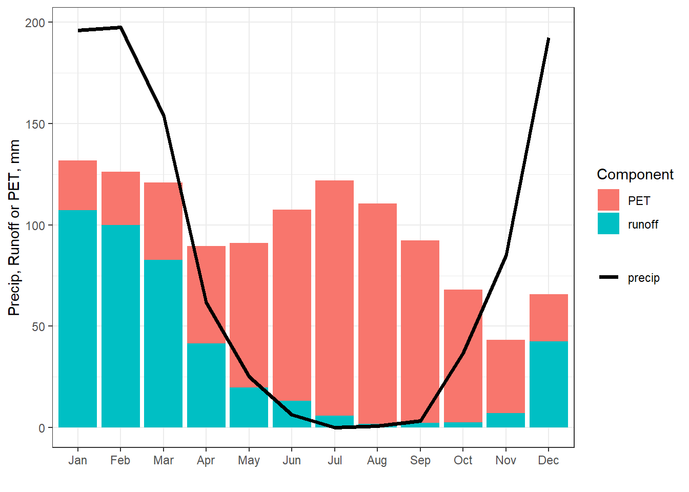
Figure 8.3: Partial water budget for the basin contributing to USGS gauge 11169500.
While incomplete, this water budget illustrates months in which the basin is water limited (runoff + PET > precipitation) or energy limited (runoff + PET < precipitation). Water is more available to recharge the soil moisture and groundwater during energy limited periods since actual evaporation, which cannot exceed PET, will leave excess water, following Equation (8.1). As another alternative, a simple water budget can be estimated from P and T and an estimate of the soil moisture holding capacity using the bioclim R package.
8.2 Precipitation observations
Direct measurement of precipitation is done with precipitation gauges, such as shown in Figure 8.4.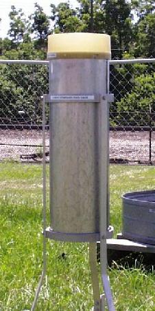
Figure 8.4: National Weather Service standard 8-inch gauge (source: NWS).
Precipitation can vary dramatically over short distances, so point measurements are challenging to work with when characterizing rainfall over a larger area. An image from an atmospheric river event over California is shown in Figure 8.5. Reflectivity values are converted to precipitation rates based on calibration with rain gauge observations.
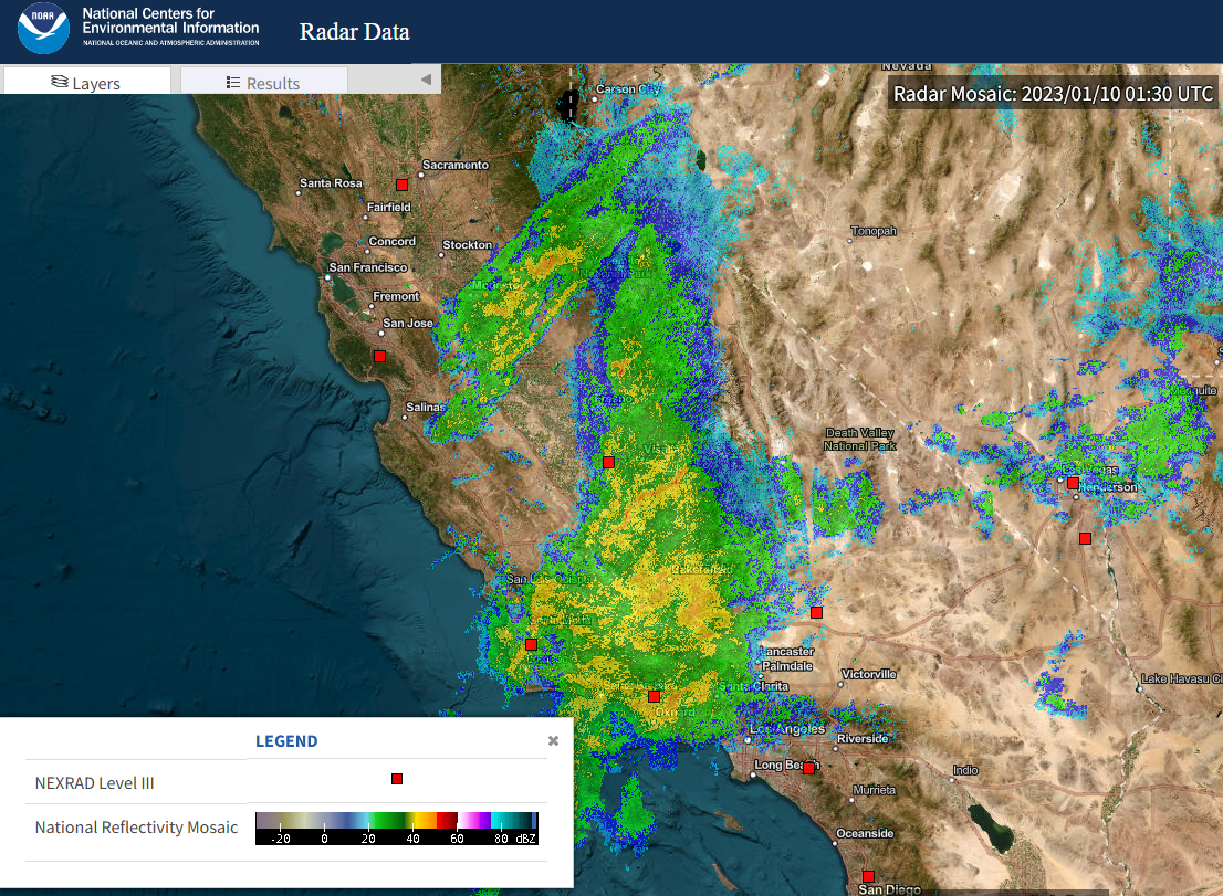
Figure 8.5: A raw radar image showing reflectivity values. Red squared indicated weather radar locations (source: NOAA).
There are additional data sets that merge many sources of data to create continuous (spatially and temporally) datasets of precipitation. While these provide excellent resources for large scale studies, we will initially focus on point observations.
Obtaining precipitation data can be done in many ways. Example 8.2 demonstrates one method using R using the FedData package.
Example 8.2 Characterize the rainfall in the city of San Jose, in Santa Clara County.
For the U.S., a good starting point is to use the mapping tools at the NOAA Climate Data Online (CDO) website. From the mapping tools page, select Observations: Daily ensure GHCN Daily is checked so you’ll look for stations that are part of the Global Historical Climatology Network and search for San Jose, CA. Figure 8.6 shows the three stations that lie within the rectangle sketched on the map, and the one that was selected.
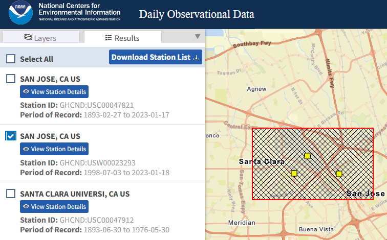
Figure 8.6: Selection results for a portion of San Jose, CA (source: CDO).
The data can be downloaded directly from the CDO site as a csv file, a sample of which is included with the hydromisc package (the sample also includes air temperature data). Note the units that you specify for the data since they will not appear in the csv file.
Note that this initial station search and data download can be automated in R using other packages:
While formats will vary depending on the source of the data, in this example we can import the csv file directly. Since units were left as ‘standard’ on the CDO website, precipitation is in inches and temperatures in oF.
datafile <- system.file("extdata", "cdo_data_ghcn_23293.csv", package="hydromisc")
ghcn_data <- read.csv(datafile,header=TRUE)
A little cleanup of the data needs to be done to ensure the DATE column is in date format, and change any missing values (often denoted as 9999 or -9999) to NA. With missing values flagged as NA, R can ignore them, set them to zero, or fill them in with functions like the zoo::na.approx() or na.spline() functions, or using the more sophisticated imputeTS package. finally, add a ‘water year’ column (a water year begins on October 1 and ends September 30).
ghcn_data$DATE <- as.Date(ghcn_data$DATE, format="%Y-%m-%d")
ghcn_data$PRCP[ghcn_data$PRCP <= -999 | ghcn_data$PRCP >= 999 ] = NA
wateryr <- function(d) {
  if (as.numeric(format(d, "%m")) >= 10) {
    wy = as.numeric(format(d, "%Y")) + 1
  } else {
    wy = as.numeric(format(d, "%Y"))
  }
}
ghcn_data$wy <- sapply(ghcn_data$DATE, wateryr)
A convenient package for characterizing precipitation is hydroTSM, the output of which is shown in Figure 8.7
library(hydroTSM)
#create a simple data frame for plotting
ghcn_prcp <- data.frame(date = ghcn_data$DATE, prcp = ghcn_data$PRCP )
#convert it to a zoo object
x <-  zoo::read.zoo(ghcn_prcp)
hydroTSM::hydroplot(x, var.type="Precipitation", main="", var.unit="inch",
pfreq = "ma", from="1999-01-01", to="2022-12-31")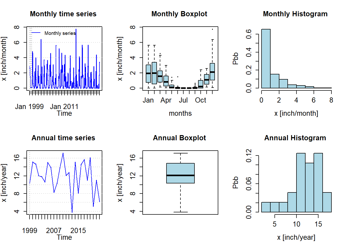
Figure 8.7: Monthly and annual precipitation summary for San Jose, CA for 1999-2022
This presentation shows the seasonality of rainfall in San Jose, with most falling between October and May. The mean is about 12 inches per year, with most years experiencing between 10-15 inches of precipitation. There are functions to produce many statistics such as monthly means.
#calculate monthly sums
monsums <- hydroTSM::daily2monthly(x, sum, na.rm = TRUE)
monavg <- as.data.frame(hydroTSM::monthlyfunction(monsums, mean, na.rm = TRUE))
#if record begins in a month other than January, need to reorder
monavg <- monavg[order(factor(row.names(monavg), levels = month.abb)),,drop=FALSE]
colnames(monavg)[1]  <- "Avg monthly precip, in"
knitr::kable(monavg, digits = 2) |>
kableExtra::kable_paper(bootstrap_options = "striped", full_width = F)| Avg monthly precip, in | |
|---|---|
| Jan | 2.23 |
| Feb | 2.26 |
| Mar | 1.75 |
| Apr | 1.03 |
| May | 0.26 |
| Jun | 0.10 |
| Jul | 0.00 |
| Aug | 0.00 |
| Sep | 0.10 |
| Oct | 0.60 |
| Nov | 1.21 |
| Dec | 2.31 |
The winter of 2016-2017 (water year 2017) was a record wet year for much of California. Figure 8.8 shows a hyetograph the daily values for that year.
ghcn_prcp2 <- data.frame(date = ghcn_data$DATE, wy = ghcn_data$wy, prcp = ghcn_data$PRCP )
ggplot(subset(ghcn_prcp2, wy==2017), aes(x=date, y=prcp)) +
  geom_bar(stat="identity",color="red") +
  labs(x="", y="precipitation, inch/day") +
  scale_x_date(date_breaks = "1 month", date_labels =  "%b %d")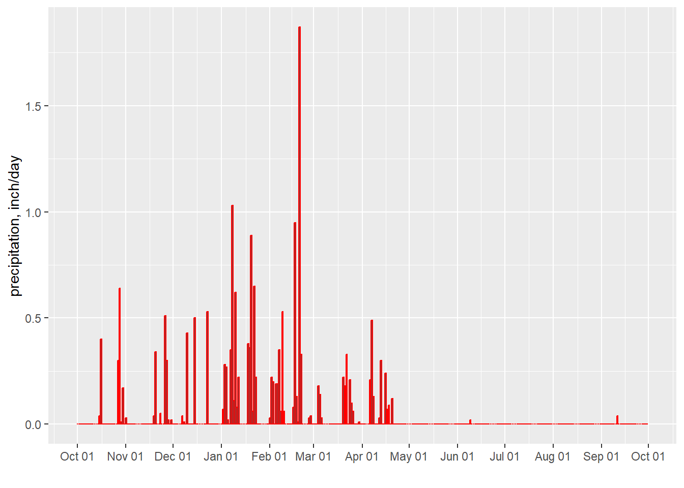
Figure 8.8: Daily Precipitation for San Jose, CA for water year 2017
While many other statistics could be calculated to characterize precipitation, only a handful more will be shown here. One will use a convenient function of the seas package. This is used in Figure 8.9.
library(tidyverse)
#The average precipitation rate for rainy days (with more then 0.01 inch)
avgrainrate <- ghcn_prcp2[ghcn_prcp2$prcp > 0.01,] |> group_by(wy) |>
  summarise(prcp = mean(prcp))
#the number of rainy days per year
nraindays <- ghcn_prcp2[ghcn_prcp2$prcp > 0.01,] |> group_by(wy) |>
  summarise(nraindays = length(prcp))
#Find length of consecutive dry and wet spells for the record
days.dry.wet <- seas::interarrival(ghcn_prcp2, var = "prcp", p.cut = 0.01, inv = FALSE)
#add a water year column to the result
days.dry.wet$wy <- sapply(days.dry.wet$date, wateryr)
res <- days.dry.wet |> group_by(wy) |> summarise(cdd = median(dry, na.rm=TRUE), cwd = median(wet, na.rm=TRUE))
res_long <- pivot_longer(res, -wy, names_to="statistic", values_to="consecutive_days")
ggplot(res_long, aes(x = wy, y = consecutive_days)) +
  geom_bar(aes(fill = statistic),stat = "identity", position = "dodge")+
  xlab("") + ylab("Median consecutive days")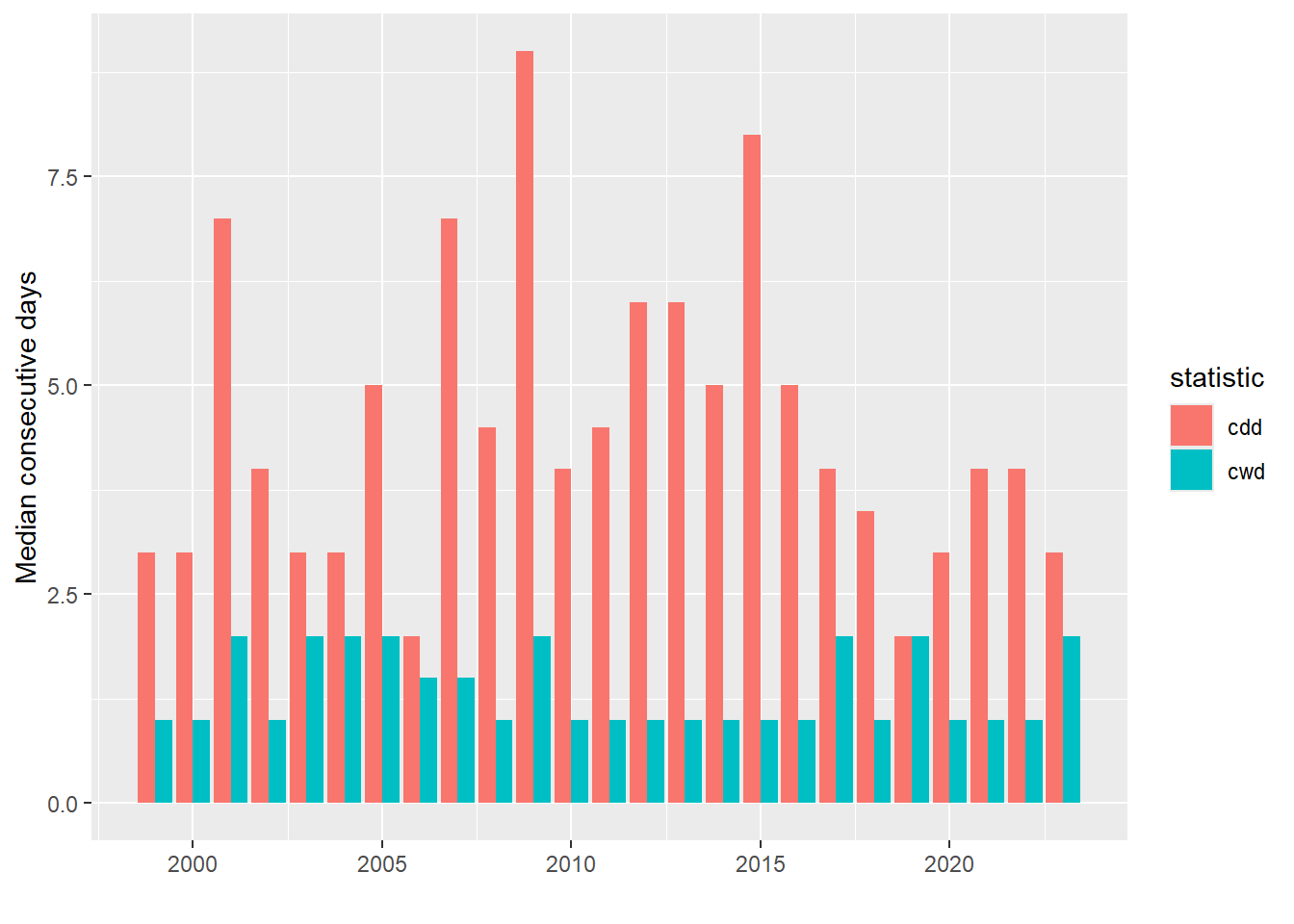
Figure 8.9: Median concecutive dry days (cdd) and wet days (cwd) for each water year.
8.3 Precipitation frequency
For engineering design, the uncertainty in predicting extreme rainfall, floods, or droughts is expressed as risk, typically the probability that a certain event will be equalled or exceeded in any year. The return period, T, is the inverse of the probability of exceedence, so that a storm with a 10% chance of being exceeded in any year (\(p_{exceed}~=0.10\)) is a \(T=\frac{1}{0.10}=10\) year storm. A 10-year storm can be experienced in multiple consecutive years, so it only means that, on average over very long periods (in a stationary climate) one would expect to see one event every T years.
In the U.S., precipitation frequency statistics are available at the NOAA Precipitation Frequency Data Server (PFDS). An example of the graphical data available there is shown in Figure 8.10.
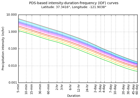
Figure 8.10: Intensity-duration-frequency (IDF) curves from the NOAA PFDS.
The calculations performed to produce the IDF curves use decades of daily data, because many years are needed to estimate the frequency with which an event might occur. As a demonstration, however, a single year can be used to illustrate the relationship between intensity and duration, which for durations longer than about 2 hours (McCuen, 2016) can be expressed as in Equation (8.3). \[\begin{equation} i = aD^b \tag{8.3} \end{equation}\] As a power curve, Equation (8.3) should be a straight line on a log-log plot. This is shown in Example 8.3.
Example 8.3 Use the 2017 water year of rainfall data for the city of San Jose, to plot the relationship between intensity and duration for the 1, 3, 7, and 30-day events.
Begin by calculating the necessary intensity and duration values.
#First extract one water year of data
df.one.year <- subset(ghcn_prcp, date>=as.Date("2016-10-01") &
                        date<=as.Date("2017-09-30"))
#Calculate the running mean value for the defined durations
dur <- c(1,3,7,30)
px <- numeric(length(dur))
for (i in 1:4) {
  px[i] <- max(zoo::rollmean(df.one.year$prcp,dur[i]))
}
#create the intensity-duration data frame
df.id <- data.frame(duration=dur,intensity=px)
Fit the theoretical curve (Equation (8.3)) using the nonlinear least squares function of the stats package (included with a base R installation), and plot the results.
#fit a power curve to the data
fit <- stats::nls(intensity ~ a*duration^b, data=df.id, start=list(a=1,b=-0.5))
print(signif(coef(fit),3))
#>      a      b
#>  1.850 -0.751
#find estimated y-values using the fit
df.id$intensity_est <- predict(fit, list(x = df.id$duration))
#duration-intensity plot with base graphics
plot(x=df.id$duration,y=df.id$intensity,log='xy', pch=1, xaxt="n",
     xlab="Duration, day" , ylab="Intensity, inches/day")
lines(x=df.id$duration,y=df.id$intensity_est,lty=2)
abline( h = c(seq( 0.1,1,0.1),2.0), lty = 3, col = "lightgray")
abline( v = c(1,2,3,4,5,7,10,15,20,30), lty = 3, col = "lightgray")
axis(side = 1, at =c(1,2,3,4,5,7,10,15,20,30) ,labels = T)
axis(side = 2, at =c(seq( 0.1,1,0.1),2.0) ,labels = T)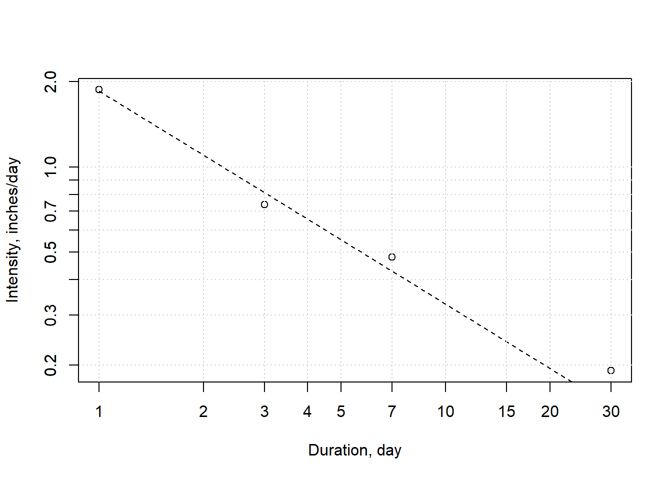
Figure 8.11: Intensity-duration relationship for water year 2017. Calculated values are based on daily data; theoretical is the power curve fit.
If this were done for many years, the results for any one duration could be combined (one value per year) and sorted in decreasing order. That means the rank assigned to the highest value would be 1, and the lowest value would be the number of years, n. The return period, T, for any event would then be found using Equation (8.4) based on the Weibull plotting position formula. \[\begin{equation} T=\frac{n+1}{rank} \tag{8.4} \end{equation}\] That would allow the creation of IDF curves for a point.
8.4 Precipitation gauge consistency – double mass curves
The method of using double mass curves to identify changes in an obervation method (such as new instrumentation or a change of location) can be applied to precipitation gauges or any other type of measurement. This method is demonstrated with an example from the U.S. Geological survey (Searcy & Hardison, 1960).
The first step is to compile data for a gauge (or better, a set of gauges) that are known to be unperturbed (Station A in the sample data set), and for a suspect gauge though to have experienced a change (Station X is this case).
annual_data <- hydromisc::precip_double_mass
knitr::kable(annual_data, digits = 2) |>
kableExtra::kable_paper(bootstrap_options = "striped", full_width = F)| Year | Station_A | Station_X |
|---|---|---|
| 1926 | 39.75 | 32.85 |
| 1927 | 29.57 | 28.08 |
| 1928 | 42.01 | 33.51 |
| 1929 | 41.39 | 29.58 |
| 1930 | 31.55 | 23.76 |
| 1931 | 55.54 | 58.39 |
| 1932 | 48.11 | 46.24 |
| 1933 | 39.85 | 30.34 |
| 1934 | 45.40 | 46.78 |
| 1935 | 44.89 | 38.06 |
| 1936 | 32.64 | 42.82 |
| 1937 | 45.87 | 37.93 |
| 1938 | 46.05 | 50.67 |
| 1939 | 49.76 | 46.85 |
| 1940 | 47.26 | 50.52 |
| 1941 | 37.07 | 34.38 |
| 1942 | 45.89 | 47.60 |
Accumulate the (annual) precipitation (measured in inches) and plot the values for the suspect station against the reference station(s), as in Figure 8.12 .
annual_sum <- data.frame(year = annual_data$Year,
                         sum_A = cumsum(annual_data$Station_A),
                         sum_X = cumsum(annual_data$Station_X))

#create scatterplot with a label on every point
library(ggrepel)
ggplot(annual_sum, aes(sum_X,sum_A, label = year)) +
  geom_point() +
  geom_text_repel(size=3, direction = "y") +
  labs(x="Cumulative precipitation at Station A, in",
       y="Cumulative precipitation at Station X, in") +
  theme_bw()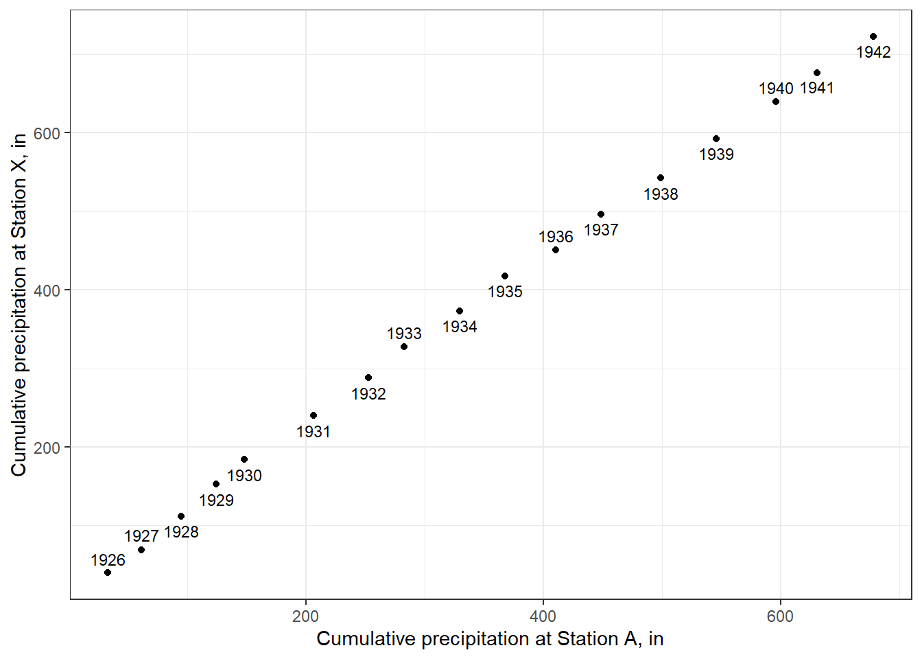
Figure 8.12: A double mass curve.
The break in slope between 1930 and 1931 appears clear. This should checked with records for the station to verify whether changes did occur at that time. If the data from Station X are to be used to fill other records or estimate long-term averages, the inconsistency needs to be corrected.
One method to highlight the year at which the break occurs is to plot the residuals from a best fit line to the cumulative data from the two stations, as illustrated by the Food and Agriculture Orgainization FAO. (Allen & United Nations, 1998)
linfit = lm(sum_X ~ sum_A, data = annual_sum)
plot(x=annual_sum$year,linfit$residuals, xlab = "Year",ylab = "Residual of regression")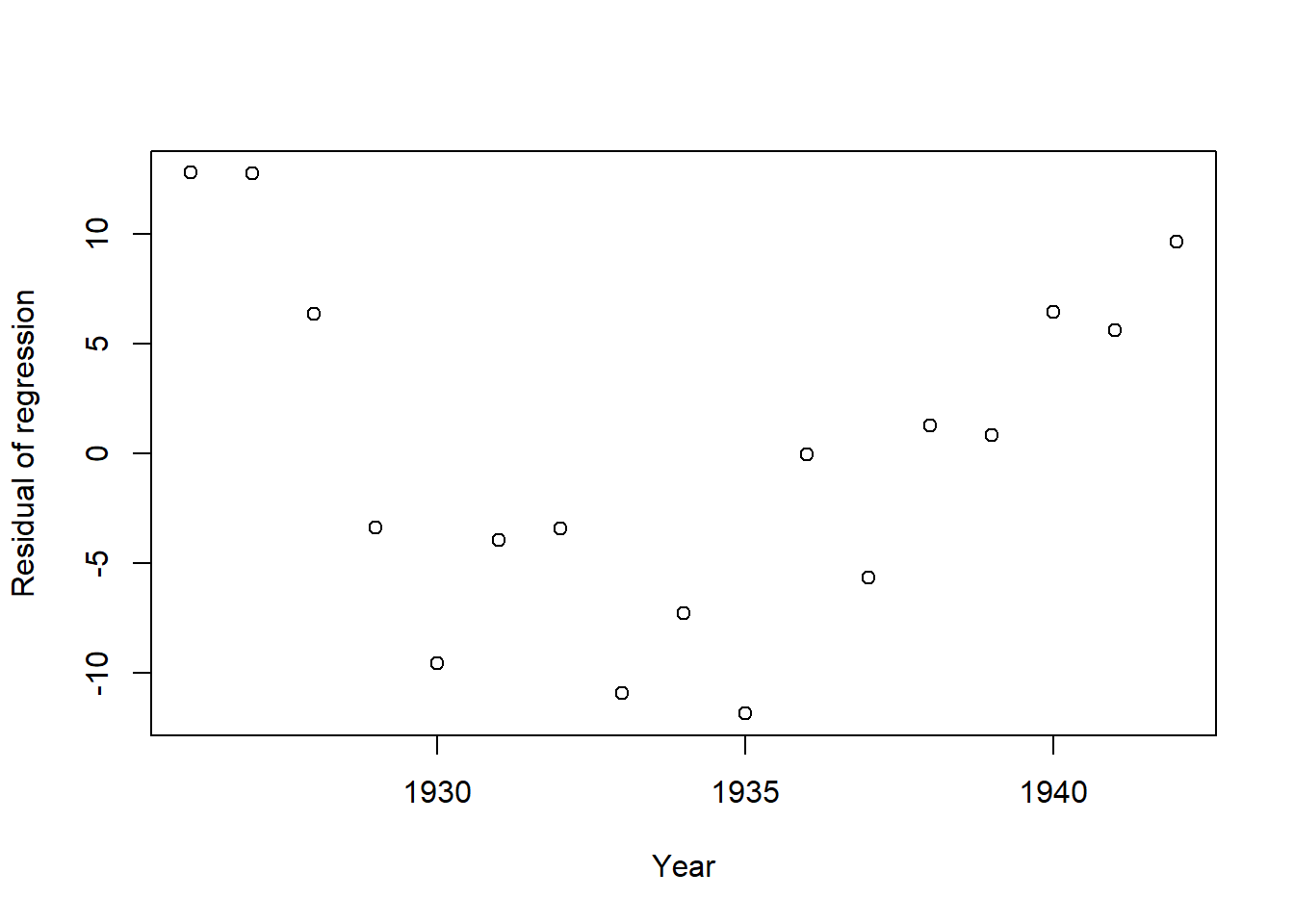
Figure 8.13: Residuals of the linear fit to the double-mass curve.
This verifies that after 1930 the steep decline ends, so it may represent a change in location or equipment.
Adusting the earlier record to be consistent with the later period is done by applying Equation (8.5). \[\begin{equation} y^{'}_i~=\frac{b_2}{b_1}y_i \tag{8.5} \end{equation}\] where b2 and b1 are the slopes after and before the break in slope, respectively, yi is original precipitation data, and y’i is the adjusted precipitation. This can be applied as follows.
b1 <- lm(sum_X ~ sum_A, data = subset(annual_sum, year <= 1930))$coefficients[['sum_A']]
b2 <- lm(sum_X ~ sum_A, data = subset(annual_sum, year > 1930))$coefficients[['sum_A']]

#Adjust early values and concatenate to later values for Station X
adjusted_X <- c(annual_data$Station_X[annual_data$Year <= 1930]*b2/b1,
                annual_data$Station_X[annual_data$Year > 1930])
annual_sum_adj <- data.frame(year = annual_data$Year,
                         sum_A = cumsum(annual_data$Station_A),
                         sum_X = cumsum(adjusted_X))

#Check that slope now appears more consistent
ggplot(annual_sum_adj, aes(sum_X,sum_A, label = year)) +
  geom_point() +
  geom_text_repel(size=3, direction = "y") +
  labs(x="Cumulative precipitation at Station A, in",
       y="Cumulative adjusted precipitation at Station X, in") +
  theme_bw()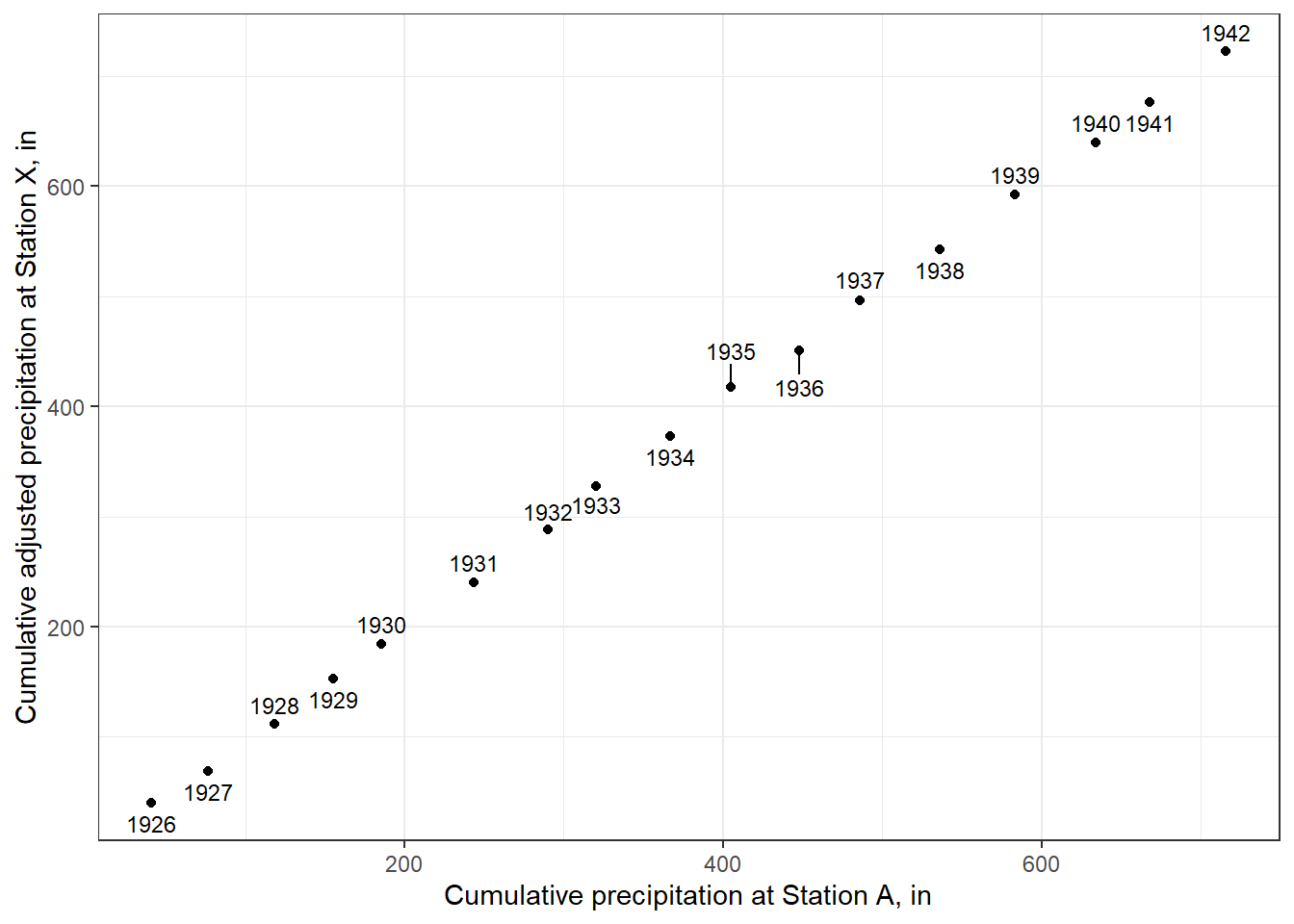
Figure 8.14: A double mass curve using adjusted data at Station X.
The plot shows a more consistent slope, as expected. Another plot of residuals could also validate the effect of the adjustment.
8.5 Precipitation interpolation and areal averaging
It is rare that there are precipitation observations exactly where one needs data, which means existing observations must be interpolated to a point of interest. This is also used to fill in missing data in a record using surrounding observations.
Interpolation is also used to use sparse observations, or observations from a variety of sources, to produce a spatially continuous grid. This is an essential step to estimating the precipitation averaged across an area that contributes streamflow to some location of concern. Estimating areal average precipitation using some simple, manual methods, has been outlined by the U.S. National Weather Service, illustrated in Figure 8.15 (source: National Weather Service).
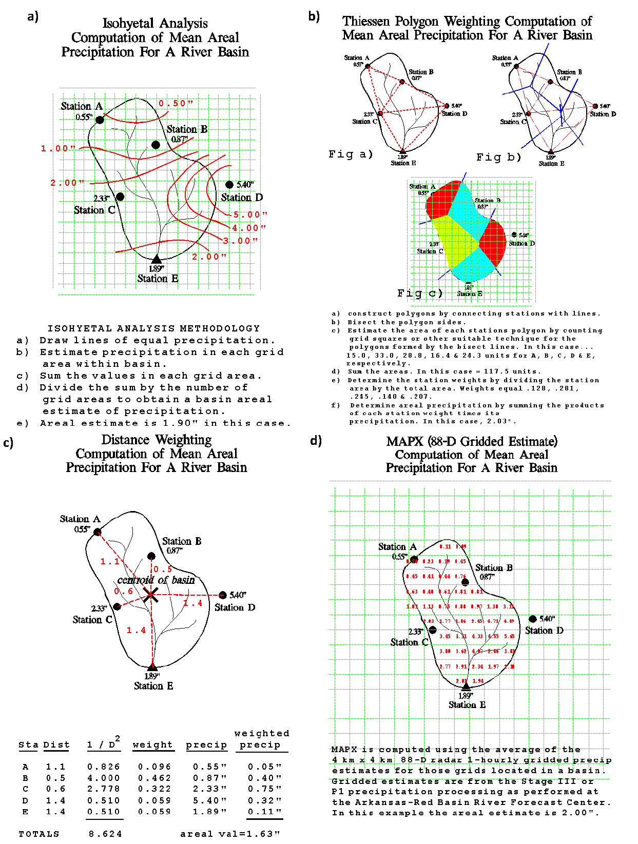
Figure 8.15: Some basic precipitation interpolation methods, from the U.S. National Weather Service.
With the advent of geographical information system (GIS) software, manual interpolation is not used. Rather, more advanced spatial analysis is performed to interpolate precipitation onto a continuous grid, where the uncertainty (or skill) of different methods can be assessed. Spatial analysis methods to do this are outlined in many other references, such as Spatial Data Science and the related book Spatial Data Science with applications in R, or the reference Geocomputation with R. (Lovelace et al., 2019; Pebesma & Bivand, 2023)
There are also many sources of precipitation data already interpolated to a regular grid. the geodata package provides access to many data sets, including the Worldclim biophysical data. Another source of global precipitation data, available at daily to monthly scales, is the CHIRPS data set, which has been widely used in many studies. An example of obtaining and plotting average annual precipitation over Santa Clara County is illustrated below.
#Load precipitation in mm, already cropped to cover most of California
datafile <- system.file("extdata", "prcp_cropped.tif", package="hydromisc")
prcp <- terra::rast(datafile)
scc_bound <- terra::vect(hydromisc::scc_county)
scc_precip <- terra::crop(prcp, scc_bound, mask=TRUE)
terra::plot(scc_precip, plg=list(title="Precip\n(mm)", title.cex=0.7))
terra::plot(scc_bound, add=TRUE)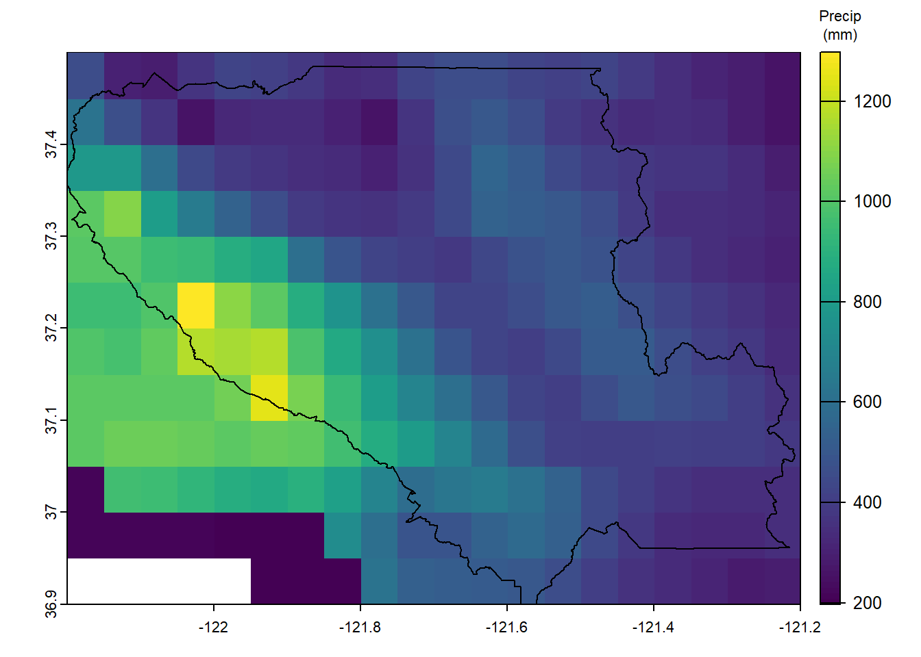
Figure 8.16: Annual Average Precipitation over Santa Clara County, mm
Spatial statistics are easily obtained using terra, a versatile package for spatial analysis.