Chapter 11 Sustainability in design: planning for change
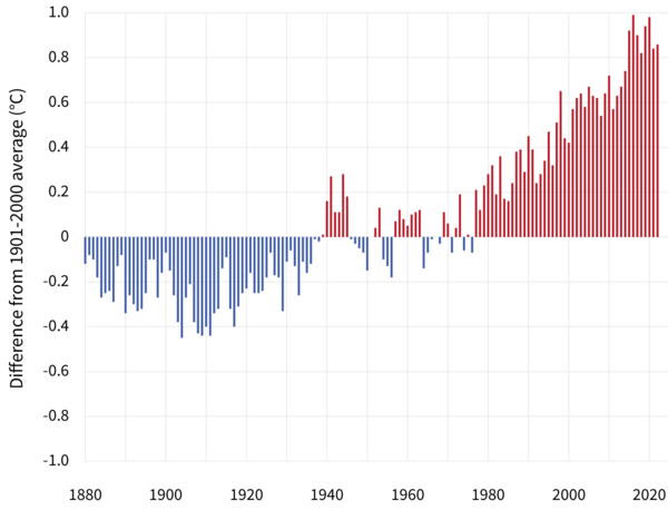
Figure 11.1: Yearly surface temperature compared to the 20th-century average from 1880–2022, from Climate.gov
All systems engineered to last more than a decade or two, so everything civil engineers work on, will need to be designed to be resilient to dramatic environmental changes. As societies respond to the impacts of a disrupted climate, demands for water, energy, housing, food, and other essential services will change. This will result in economic disruption as well. This chapter presents a few ways long-term sustainability can be considered, looking at sensitivity of systems, detection of shifts or trends, and how economic and management may respond. This is much more brief than this rich topic deserves.
The hydromisc package will need to be installed to access some of the data used below. If it is not installed, do so following the instructions on the github site for the package.
11.1 Perturbing a system
when a system is perturbed it can respond in many ways. A useful classification of these was developed by (Marshall & Toffel, 2005). Figure 11.2 is an adaptation of Figure 2 from that paper.
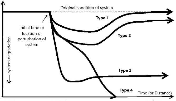
Figure 11.2: Pathways of recovery or degradation a system may take after initial perturbation.
In essence, after a system is degraded, it can eventually rebound to its original condition (Type 1), rebound to some other state that is degraded from its original (Types 2 and 3), or completely collapse (Type 4). Which path it taken depends on the degree of the initial disruption and the ability of the system to recover.
While originally cast with time as the x-axis, Figure 11.2 is equally applicable when looking at a system that travels over a distance, such as a flowing river. The form of the curves in Figure 11.2 appear similar to a classic dissolved oxygen sag curve, as in Figure 11.3.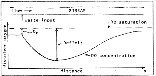
Figure 11.3: Dissolved oxygen levels in a steam following an input of waste (source: EPA).
The Streeter-Phelps equation describes the response of the dissolved oxygen (DO) levels in a water body to a perturbation, such as the discharge of wastewater with a high oxygen demand. Some important assumptions are that steady-state conditions exist, and the flow moves as plug flow, progressing downstream along a one-dimensional path. Following is Streeter-Phelps Equation (11.1). \[\begin{equation} D=C_s-C=\frac{K_1^\prime L_0}{K_2^\prime - K_1^\prime}\left(e^{-K_1^\prime t}-e^{-K_2^\prime t}\right)+D_0e^{-K_2^\prime t} \tag{11.1} \end{equation}\] where \(D\) is the DO deficit, \(C_s\) is the saturation DO concentration, \(C\) is the DO concentration, \(D_0\) is the initial DO deficit, \(L_0\) is the ultimate (first-stage) BOD at the discharge, calculated by Equation (11.2). \[\begin{equation} L_0=\frac{BOD_5}{1-e^{-K_1^\prime t}} \tag{11.2} \end{equation}\] \(K_1^\prime\) and \(K_2^\prime\) are the deoxygenation and reaeration coefficients, both adjusted for temperature. Usually the coefficients \(K_1\) and \(K_2\) are defined at 20\(^\circ\)C, and then adjusted by empirical relationships for the actual water temperature using Equation (11.3). \[\begin{equation} K^\prime = K\theta ^{T-20} \tag{11.3} \end{equation}\] where \(\theta\) is set to typical values of 1.135 for \(K_1\) for \(T\le20^\circ C\) (and 1.056 otherwise) and 1.024 for \(K_2\).
As a demonstration, functions (only available for SI units) in the hydromisc package can be used to explore the recovery of an aquatic system from a perturbation, as in Example 11.1.
Example 11.1 A river with a flow of 7 \(m^3/s\) and a velocity of 1.4 m/s has effluent discharged into it at a rate of 1.5 \(m^3/s\). The river upstream of the discharge has a temperature of 15\(^\circ\)C, a \(BOD_5\) of 1 mg/L, and a dissolved oxygen saturation of 90 percent. The effluent is 21\(^\circ\)C with a \(BOD_5\) of 180 mg/L and a dissolved oxygen saturation of 0 percent. The deoxygenation rate constant (at 20\(^\circ\)C) is 0.4 \(d^{-1}\), and the reaeration rate constant is 0.8 \(d^{-1}\). Create a plot of DO as a percent of saturation (y-axis) vs. distance in km (x-axis).
First set up the model parameters.
Q <- 7             # flow of stream, m3/s
V <- 1.4           # velocity of stream, m/s
Qeff <- 1.5        # flow rate of effluent, m3/s
DOsatupstr <- 90   # DO saturation upstream of effluent discharge, %
DOsateff <- 0      # DO saturation of effluent discharge, %
Triv <- 15         # temperature of receiving water, C
Teff <- 21         # temperature of effluent, C
BOD5riv <- 1       # 5-day BOD of receiving water, mg/L
BOD5eff <- 180     # 5-day BOD of effluent, mg/L
K1 <- 0.4          # deoxygenation rate constant at 20C, 1/day
K2 <- 0.8          # reaeration rate constant at 20C, 1/day
Calculate some of the variables needed for the Streeter-Phelps model. Type ?hydromisc::DO_functions for more information on the DO-related functions in the hydromisc package.
Tmix <- hydromisc::Mixture(Q, Triv, Qeff, Teff)
K1adj <- hydromisc::Kadj_deox(K1=K1, T=Tmix)
K2adj <- hydromisc::Kadj_reox(K2=K2, T=Tmix)
BOD5mix <- hydromisc::Mixture(Q, BOD5riv, Qeff, BOD5eff)
L0 <- BOD5mix/(1-exp(-K1adj*5)) #BOD5 - ultimate
Find the dissolved oxygen for 100 percent saturation (assuming no salinity) and the initial DO deficit at the point of discharge.
Cs <- hydromisc::O2sat(Tmix) #DO saturation, mg/l
C0 <- hydromisc::Mixture(Q, DOsatupstr/100.*Cs, Qeff, DOsateff/100.*Cs) #DO init, mg/l
D0 <- Cs - C0 #initial deficit
Determine a set of distances where the DO deficit will be calculated, and the corresponding times for the flow to travel that distance.
Finally, calculate the DO (as a percent of saturation) and plot the results.
DO_def <- hydromisc::DOdeficit(t=ts, K1=K1adj, K2=K2adj, L0=L0, D0=D0)
DO_mgl <- Cs - DO_def
DO_pct <- 100*DO_mgl/Cs
plot(xs,DO_pct,xlim=c(0,800),ylim=c(0,100),type="l",xlab="Distance, km",ylab="DO, %")
grid()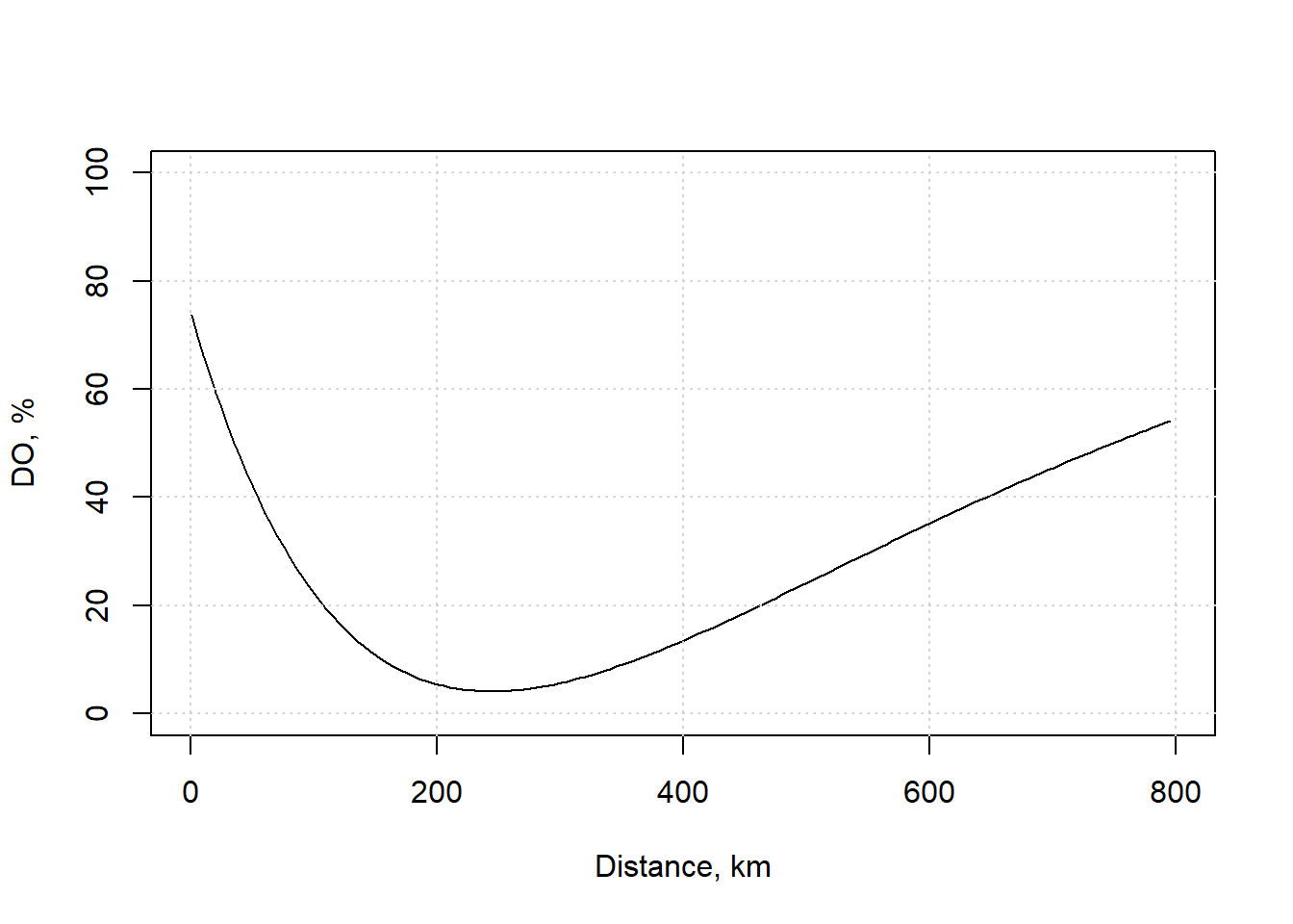
Figure 11.4: Dissolved oxygen for this example.
For this example, the saturation DO concentration is 9.9 mg/L, meaning the minimum value of the curve corresponds to about 4 mg/L. The EPA notes that values this low are below that recommended for the protection of aquatic life in freshwater. This shows that while the ecosystem has not collapsed, (i.e., following a Type 4 curve in Figure 11.2), effective ecosystem functions may be lost.
11.2 Detecting changes in hydrologic data
Planning for decades or more requires the ability to determine whether changes are occurring or have already occurred. Two types of changes will be considered here: step changes, caused by an abrupt change such as deforestation or a new pollutant source, and monotonic (either always increasing or decreasing) trends, caused by more gradual shifts. these are illustrated in Figures 11.5 and 11.6.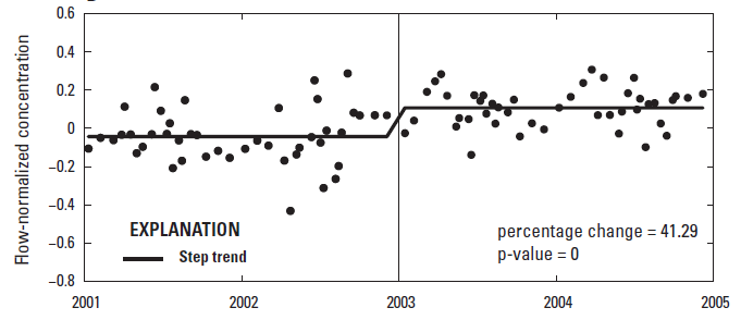
Figure 11.5: A shift in phosphorus concentrations (source: USGS Scientific Investigations Report 2017-5006, App. 4, https://doi.org/10.3133/sir20175006).
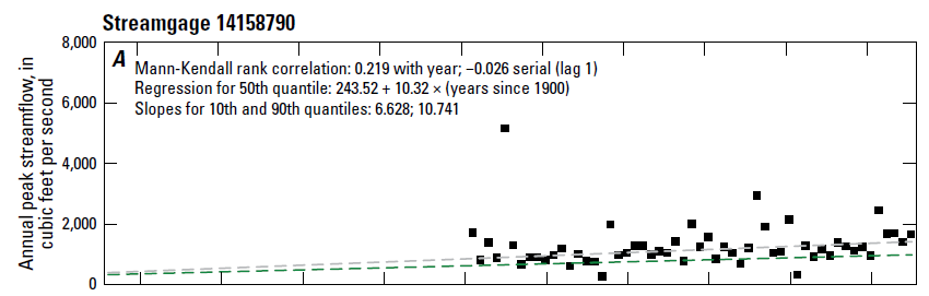
Figure 11.6: A trend in annual peak streamflow. (source: USGS Professional Paper 1869, https://doi.org/10.3133/pp1869).
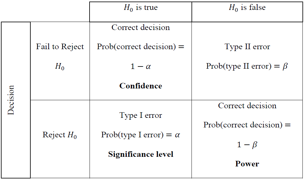
Figure 11.7: Four possible results of hypothesis testing. (source: Helsel et al., 2020).
In the context of the example that follows, the null hypothesis, H0, is usually a statement that no trend exists. The \(\alpha\)-value (the significance level) is the probability of incorrectly rejecting the null hypothesis, that is rejecting H0 when it is in fact true. The significance level that is acceptable is a decision that must be made – a common value of \(\alpha\)=0.05 (5 percent) significance, also referred to as \(1-\alpha=0.95\) (95 percent) confidence.
A statistical test will produce a p-value, which is essentially the likelihood that the null hypothesis is true, or more technically, the probability of obtaining the calculated test statistic (on one more extreme) when the null hypothesis is true. Again, in the context of trend detection, small p-values (less than \(\alpha\)) indicate greater confidence for rejecting the null hypothesis and thus supporting the existence of a “statistically significant” trend.
One of the most robust impacts of a warming climate is the impact on snow. In California, historically the peak of snow accumulation tended to occur roughly on April 1 on average. To demonstrate methods for detecting changes data from the Four Trees Cooperative Snow Sensor site in California, obtained from the USDA National Water and Climate Center. These data are available as part of the hydromisc package.
swe <- hydromisc::four_trees_swe
plot(swe$Year, swe$April_1_SWE_in, xlab="Year", ylab="April 1 Snow Water Equivalent, in")
lines(zoo::rollmean(swe, k=5), col="blue", lty=3, cex=1.4)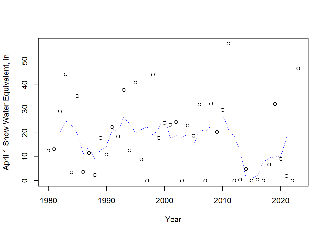
Figure 11.8: April 1 snow water equivalent at Four Trees station, CA. The dashed line is a 5-year moving average.
A plot is always useful – here a 5-year moving average, or rolling mean, is added (using the zoo package), to make any trends more observable.
11.2.1 Detecting a step change
When there is a step change in a record, you need to test that the difference between the “before” and “after” conditions is large enough relative to natural variability that is can be confidently described as a change. In other words, whether the change is significant must be determined. This is done by breaking the data into two-samples and applying a statistical test, such as a t-test or the nonparametric rank-sum (or Mann-Whitney U) test.
While for this example there is no obvious reason to break this data at any particular year, we’ll just look at the first and second halves. Separate the two subsets of years into two arrays of (y) values (not data frames in this case) and then create a boxplot of the two periods.
yvalues1 <- swe$April_1_SWE_in[(swe$Year >= 1980) & (swe$Year <= 2001)]
yvalues2 <- swe$April_1_SWE_in[(swe$Year >= 2002) & (swe$Year <= 2023)]
boxplot(yvalues1,yvalues2,names=c("1980-2001","2002-2023"),boxwex=0.2,ylab="swe, in") 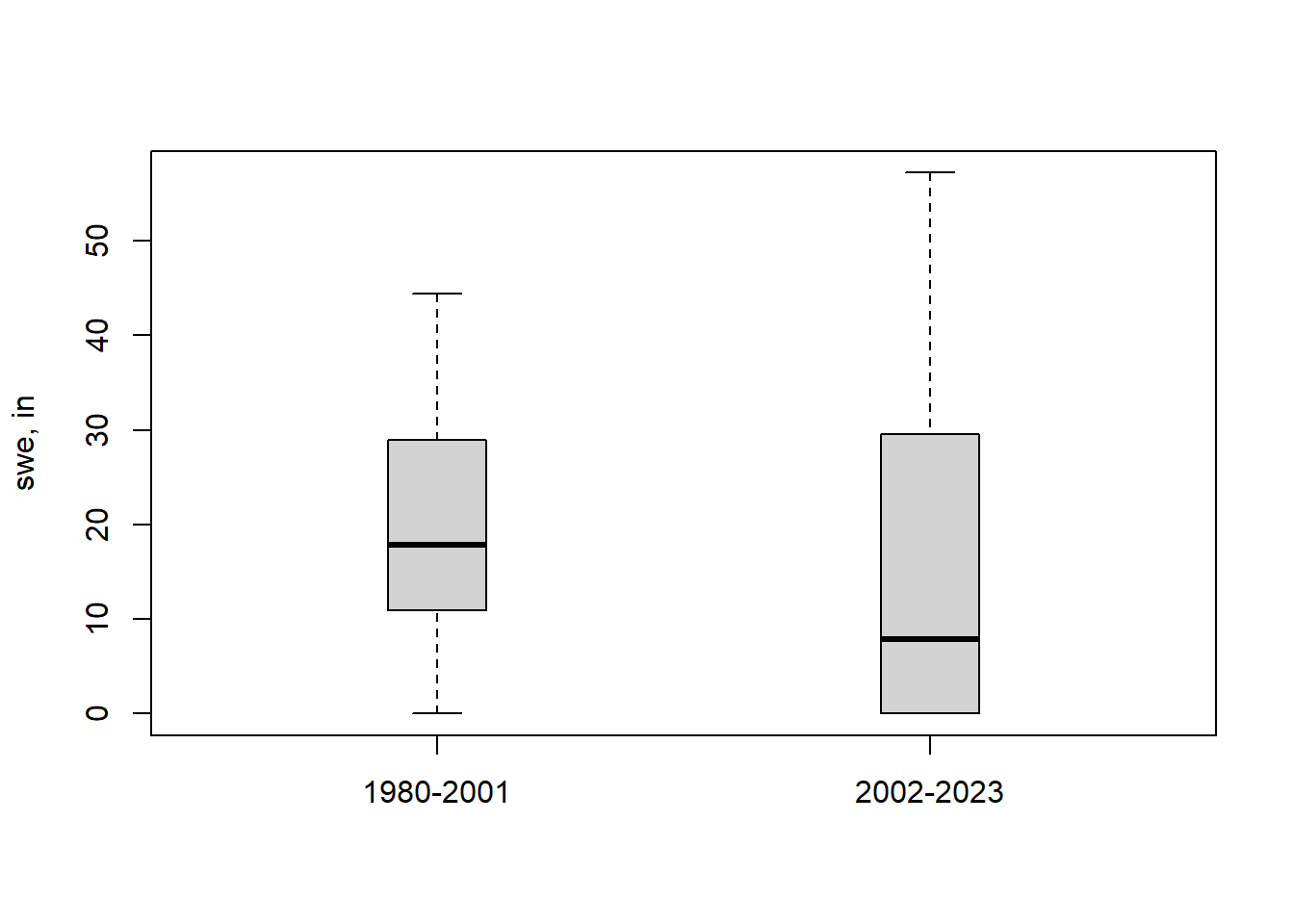
Figure 11.9: Comparison of two records of SWE at Four Trees station, CA.
Calculate the means and medians of the two periods, just for illustration.
data.frame(period=c("1980-2001","2002-2023"),
           mean=c(mean(yvalues1), mean(yvalues2)),
           median=c(median(yvalues1), median(yvalues2))) |>
  kableExtra::kbl(table.attr = "style='width:50%;'",
          caption = "Means and medians for 2 periods",
          digits=1) |>
kableExtra::kable_classic(full_width = T, position = "center")| period | mean | median |
|---|---|---|
| 1980-2001 | 19.8 | 17.8 |
| 2002-2023 | 15.4 | 7.9 |
The mean for the later period is lower, as is the median. the question to pose is whether these differences are statistically significant. The following tests allow that determination.
11.2.1.1 Method 1: Using a t-test.
A t-test determines the significance of a difference in the mean between two samples under a number of assumptions. These include independence of each data point (in this example, that any year’s April 1 SWE is uncorrelated with prior years) and that the data are normally distributed. This is performed with the t.test function. The alternative argument is included that the test is “two sided”; a one-sided test would test for one group being only greater than or less than the other, but here we only want to test whether they are different. The paired argument is set to FALSE since there is no correspondence between the order of values in each subset of years.
t.test(yvalues1, yvalues2, var.equal = FALSE, alternative = "two.sided", paired = FALSE)
#>
#>  Welch Two Sample t-test
#>
#> data:  yvalues1 and yvalues2
#> t = 0.91863, df = 40.084, p-value = 0.3638
#> alternative hypothesis: true difference in means is not equal to 0
#> 95 percent confidence interval:
#>  -5.181634 13.817998
#> sample estimates:
#> mean of x mean of y
#>  19.76364  15.44545
Here the p-value is 0.36, a value much greater than \(\alpha = 0.05\), so the null hypothesis cannot be rejected. The difference in the means is not significant based on this test. As an example, if you want to extract just the p-value from the t.test you could use something like t.test(yvalues1, yvalues2, "t")$p.value.
11.2.1.2 Method 2: Wilcoxon rank-sum (or Mann-Whitney U) test.
Like the t-test, the rank-sum test produces a p-value, but it measures a more generic measure of “central tendency” (such as a median) rather than a mean. Assumptions about independence of data are still necessary, but there is no requirement of normality of the distribution of data. It is less affected by outliers or a few extreme values than the t-test.
This is performed with a standard R function. Other arguments are set as with the t-test.
wilcox.test(yvalues1, yvalues2, alternative = "two.sided", paired=FALSE)
#> Warning in wilcox.test.default(yvalues1, yvalues2, alternative = "two.sided", :
#> cannot compute exact p-value with ties
#>
#>  Wilcoxon rank sum test with continuity correction
#>
#> data:  yvalues1 and yvalues2
#> W = 297, p-value = 0.1999
#> alternative hypothesis: true location shift is not equal to 0
The p-value is much lower than with the t-test, showing less influence of the two very high SWE values in the second half of the record. Output values can be extracted similarly to the t.test.
11.2.2 Detecting a monotonic trend
In a similar way to the step change, a monotonic trend can be tested using parameteric or non-parametric methods. Here we use the entire record to detect trends over the entire period. Linear regression may be used as a parametric method, which makes assumptions similar to the t-test (that residuals of the data are normally distributed). If the data do not conform to a normal distribution, the Mann-Kendall test can be applied, which is a non-parametric test.
11.2.2.1 Method 1: Regression
To perform a linear regression in R, build a linear regression model (lm). This can take the swe data frame as input data, specifying the columns to relate linearly.
m <- lm(April_1_SWE_in ~ Year, data = swe)
summary(m)$coefficients
#>                Estimate  Std. Error    t value  Pr(>|t|)
#> (Intercept) 347.3231078 370.6915171  0.9369600 0.3541359
#> Year         -0.1647357   0.1852031 -0.8894868 0.3788081
The row for “Year” provides the data on the slope. The slope shows SWE declines by 0.16 inches/year based on regression. The p-value for the slope is 0.379, much larger than the typical \(\alpha\), meaning we cannot claim that a significant slope exists based on this test. So while a declining April 1 snowpack is observed at this location, it is not outside of the natural variability of the data based on a regression analysis. The full set of regression output, such as the \(R^2\) value, can be seen using summary(m). Individual results can be saved to variables using something like slope <- m$coefficients["Year"]. The p-value for the slope can be obtained by using the (row,col) of the coefficient, like pval <- summary(m)$coefficients[2,4]. Extracting the \(R^2\) value is done using R2 <- summary(m)$r.squared and adjusted \(R^2\) (for multiple regression) uses summary(m)$adj.r.squared.
11.2.2.2 Method 2: Mann-Kendall
To conduct a Mann-Kendall trend test, additional packages need to be installed. There are a number available; what is shown below is one method.
A non-parametric trend test (and plot) requires a few extra packages, which are installed like this:
if (!require('Kendall', quietly = TRUE)) install.packages('Kendall')
if (!require('zyp', quietly = TRUE)) install.packages('zyp')
Now the significance of the trend can be calculated. The slope associated with this test, the “Thiel-Sen slope”, is calculated using the zyp package.
mk <- Kendall::MannKendall(swe$April_1_SWE_in)
summary(mk)
#> Score =  -99 , Var(Score) = 9729
#> denominator =  934.4292
#> tau = -0.106, 2-sided pvalue =0.32044
ss <- zyp::zyp.sen(April_1_SWE_in ~ Year, data=swe)
ss$coefficients
#>   Intercept        Year
#> 291.1637542  -0.1385452
The non-parametric slope shows April 1 SWE declining by 0.14 inches per year over the period. Again, however, the p-value is greater than the typical \(\alpha\), so based on this method the trend is not significantly different from zero. As with the tests for a step change, the p-value is lower for the nonparametric test.
A summary plot of the slopes of both methods is helpful.
plot(swe$Year,swe$April_1_SWE_in, xlab = "Year",ylab = "Snow water equivalent, in")
abline(m, lty=1, col="black")        # plots regression line
abline(a = ss$coefficients["Intercept"], b = ss$coefficients["Year"], col="red", lty=2)
legend("topright", legend=c("Observations","Regression","Thiel-Sen"),
  col=c("black","black","red"),lty = c(NA,1,2), pch = c(1,NA,NA), cex=0.8)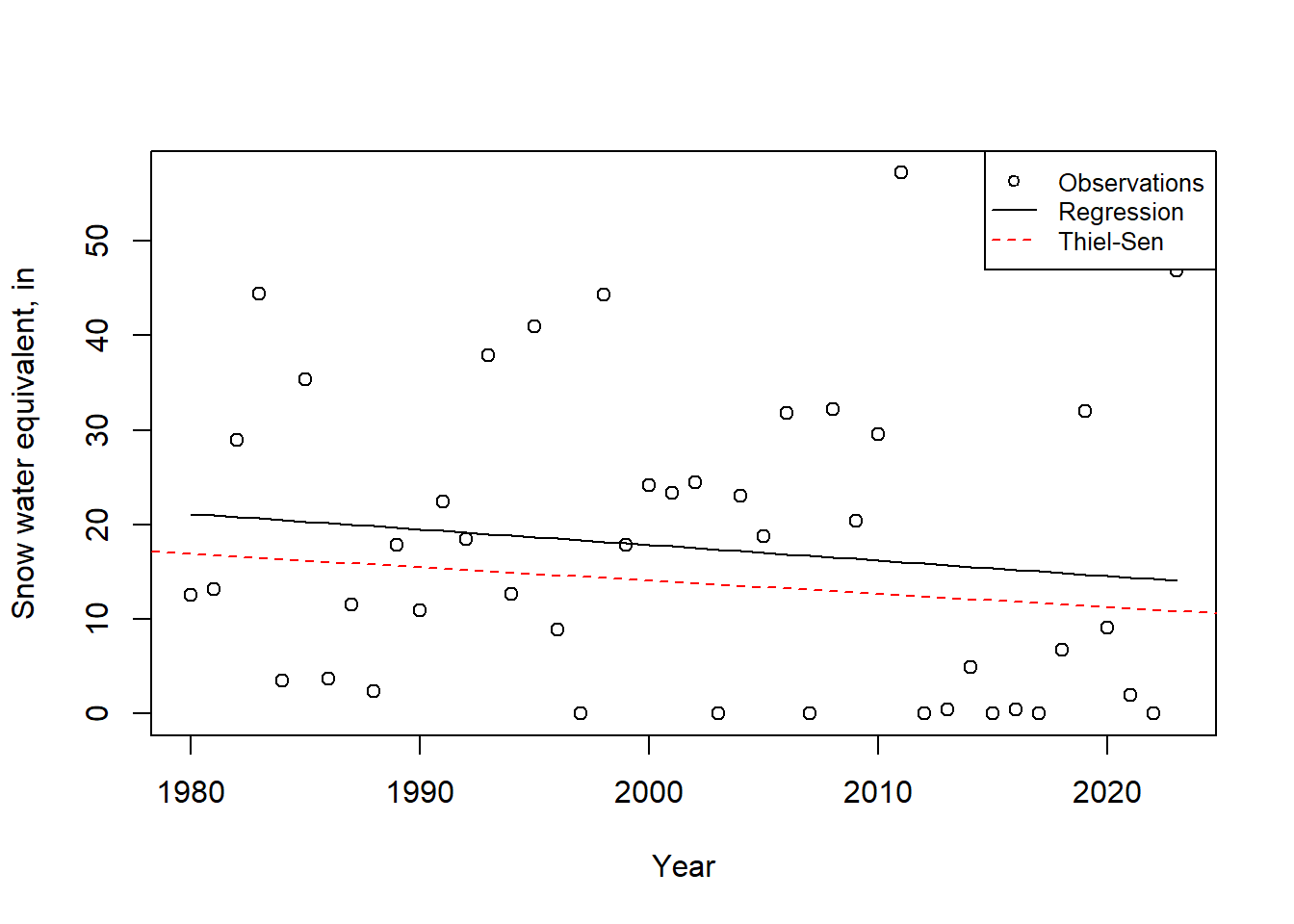
Figure 11.10: Trends of SWE at Four Trees station, CA.
11.2.3 Choosing whether to use parametric or non-parametric tests
Using the parametric tests above (t-test, regression) requires making an assumption about the underlying distribution of the data, which non-parametric tests do not require. When using a parametric test, the assumption of normality can be tested. For example, for the regression residuals can be tested with the following, where the null hypothesis is that the data are normally distributed.
This produces a very small p-value (p < 0.01), meaning the null hypothesis that the residuals are normally distributed is rejected with >99% confidence. This means non-parametric test is more appropriate. In general, non-parametric tests are preferred in hydrologic work because data (and residuals) are rarely normally distributed.
11.3 Detecting changes in extreme events
When looking at extreme events like the 100-year high tide, the methods are similar to those used in flood frequency analysis. One distinction is that flood frequency often uses a Gumbel or Log-Pearson type 3 distribution. For sea-level rise (and many other extreme events) other distributions are employed, with one common one being the Generalized Extreme Value (GEV), the cumulative distribution of which is described by Equation (11.4). \[\begin{equation} F\left(x;\mu,\sigma,\xi\right)=exp\left[-\left(1+\xi\left(\frac{x-\mu}{\sigma}\right)\right)^{-1/\xi}\right] \tag{11.4} \end{equation}\] The three parameters \(\xi\), \(\mu\), and \(\sigma\) represent a shape, location, and scale of the distribution function. These distribution parameters can be determined using observations of extremes over a long period or over different periods of record, much as the mean, standard, deviation, and skew are used in flood frequency calculations. The distribution can then be used to estimate the probability associated with a specific magnitude event, or conversely the event magnitude associated with a defined risk level. An excellent example of that is from Tebaldi et al. (2012) who analyzed projected extreme sea level changes through the 21st century.
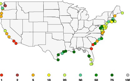
Figure 11.11: Projected return periods by 2050 for floods that are 100 yr events during 1959–2008, Tebaldi et al., 2012
An example using the GEV with sea level data is illustrated below. The Tebaldi et al. (2012) paper uses the R package extRemes, which we will use here. The same package has been used to study extreme wind, precipitation, temperature, streamflow, and other events, so it is a very versatile and widely-used package. Install the package if it is not already installed.
11.3.1 Obtaining and preparing sea-level data
Sea-level data can be downloaded directly into R using the rnoaa package, though it is due to be replaced and cannot download more recent data. Fortunately, NOAA also has a very intuitive interface that allows geographical searching and preliminary viewing of data. From the NOAA Tides & Currents site one can search an area of interest and find a tide gauge with a long record. Figure 11.12.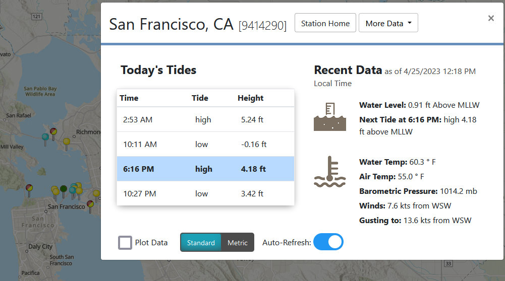
Figure 11.12: Identification of a sea-level gauge on the NOAA Tides & Currents site.
By exploring the data inventory for this station, on its home page, you can see the gauge has a very long record, being established in 1854, so it has measured extremes for over a century. When selecintg data, avoid selecting a partial month, or you may not have the ability to download monthly data. Monthly data for this site were downloaded and saved as a csv file, which is available with the hydromisc package.
datafile <- system.file("extdata", "sealevel_9414290_wl.csv", package="hydromisc")
dat <- read.csv(datafile,header=TRUE)
These data were saved in metric units, so all levels are in meters above the selected tidal datum. There are dates indicating the month associated with each value (and day 1 is in there as a placeholder).
If there are any missing data they may be labeled as “NaN”. If you see that, a clean way to address it is to first change the missing data to NA (which R recognizes) with a command such as
For this example we are looking at extreme tide levels, so only retain the “Highest” and “Date” columns.
A final data preparation is to create an annual time series with the the maximum tide level in any year. One way to facilitate this is to add a column of “year.” Then the data can be aggregated by year, creating a new data frame, taking the maximum value for each year (many other functions, like mean, median, etc. can also be used). In this example the column names are changed to make it easier to work with the data. Also, the year column is converted to an integer for plotting purposes. Any rows with NA values are removed.
peak_sl$year <- as.integer(strftime(peak_sl$Date, "%Y"))
peak_sl_ann <- aggregate(peak_sl$Highest,by=list(peak_sl$year),FUN=max, na.rm=TRUE)
colnames(peak_sl_ann) <- c("year","peak_m")
peak_sl_ann <- na.exclude(peak_sl_ann)
A plot is always helpful.
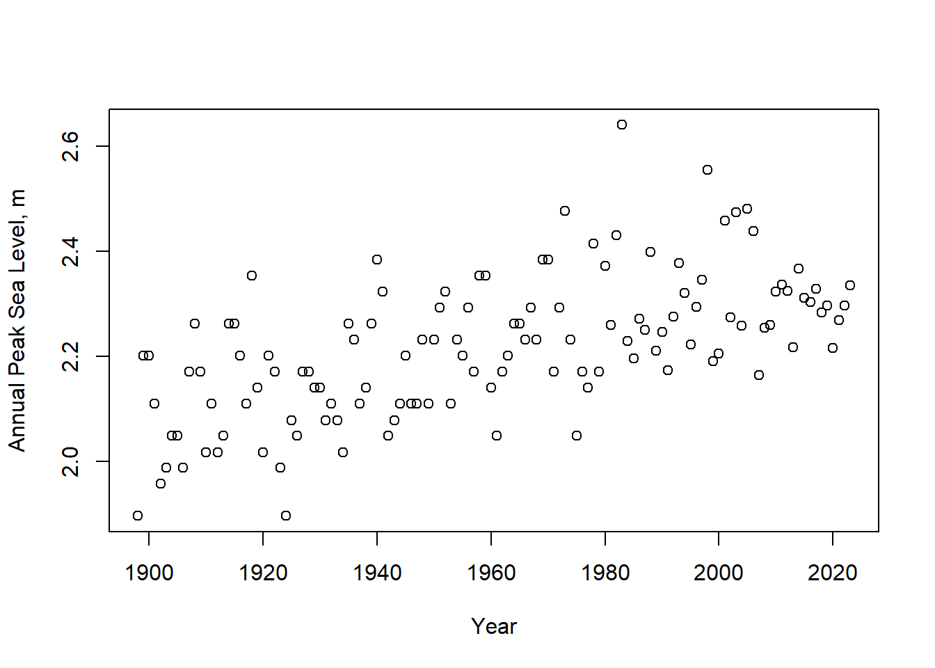
Figure 11.13: Annual highest sea-levels relative to MLLW at gauge 9414290.
11.3.2 Conducting the extreme event analysis
The question we will attempt to address is whether the 100-year peak tide level (the level exceeded with a 1 percent probability) has increased between the 1900-1930 and 1990-2020 periods. Extract a subset of the data for one period and fit a GEV distribution to the values. Specify units of meters for axis labeling.
peak_sl_sub1 <- subset(peak_sl_ann, year >= 1900 & year <= 1930)
gevfit1 <- extRemes::fevd(peak_sl_sub1$peak_m, units = "m")
gevfit1$results$par
#>   location      scale      shape
#>  2.0747606  0.1004844 -0.2480902
A plot of return periods (by specifying type="rl" for return level) for the fit distribution is available.
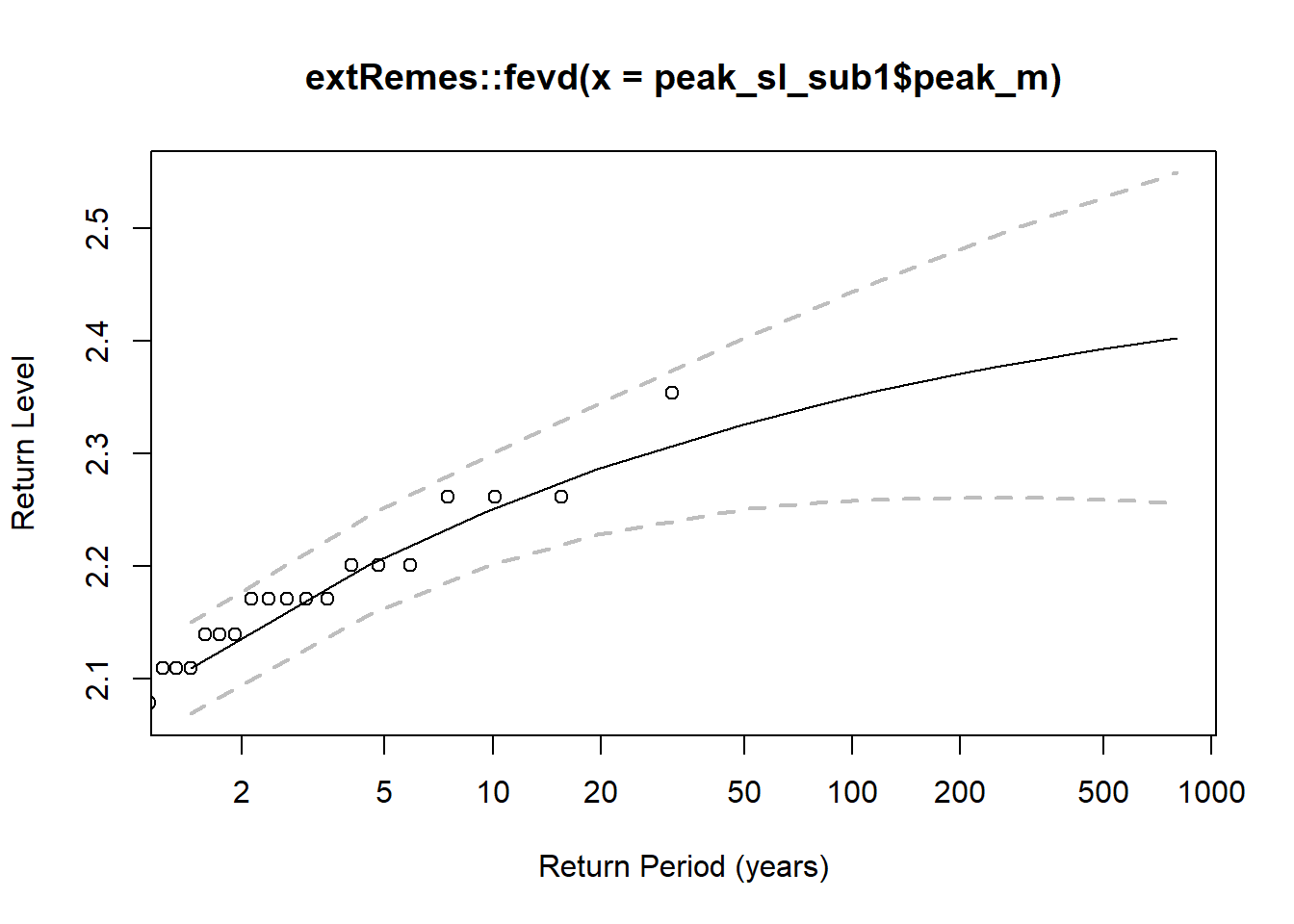
Figure 11.14: Return periods based on the fit GEV distribution for 1900-1930. Points are observations; dashed lines enclose the 95% confidence interval.
As is usually the case, a statistical model does well in the area with observations, but the uncertainty increases for extreme values (like estimating a 500-year event from a 30-year record). A longer record produces better (less uncertain) estimates at higher return periods.
Based on the GEV fit, the 100-year recurrence interval extreme tide is determined using:
extRemes::return.level(gevfit1, return.period = 100, do.ci = TRUE, verbose = FALSE)
#> extRemes::fevd(x = peak_sl_sub1$peak_m, units = "m")
#>
#> [1] "Normal Approx."
#>
#> [1] "100-year return level: 2.35"
#>
#> [1] "95% Confidence Interval: (2.2579, 2.4429)"
A check can be done using the reverse calculation, estimating the return period associated with a specified value of highest water level. This can be done by extracting the three GEV parameters, then running the pevd command.
loc <- gevfit1$results$par[["location"]]
sca <- gevfit1$results$par[["scale"]]
shp <- gevfit1$results$par[["shape"]]
extRemes::pevd(2.35, loc = loc, scale = sca , shape = shp, type = c("GEV"))
#> [1] 0.9898699
This returns a value of 0.99 (this is the cumulative distribution function, CDF, value, or the probability of non-exceedence, F). Recalling that return period, \(T=1/P=1/(1-F)\), where P=prob. of exceedence; F=prob. of non-exceedence, the result that 2.35 meters is the 100-year highest water level is validated.
Repeating the calculation for a more recent period:
peak_sl_sub2 <- subset(peak_sl_ann, year >= 1990 & year <= 2020)
gevfit2 <- extRemes::fevd(peak_sl_sub2$peak_m, units = "m")
extRemes::return.level(gevfit2, return.period = 100, do.ci = TRUE, verbose = FALSE)
#> extRemes::fevd(x = peak_sl_sub2$peak_m, units = "m")
#>
#> [1] "Normal Approx."
#>
#> [1] "100-year return level: 2.597"
#>
#> [1] "95% Confidence Interval: (2.3983, 2.7957)"
This returns a 100-year high tide of 2.6 m for 1990-2020, a 10.6 % increase over 1900-1930. Another way to look at this is to find out how the frequency of the past (in this case, 1900-1930) 100-year event has changed with rising sea levels. Repeating the calculations from above to capture the GEV parameters for the later period, and then plugging in the 100-year high tide from the early period:
loc2 <- gevfit2$results$par[["location"]]
sca2 <- gevfit2$results$par[["scale"]]
shp2 <- gevfit2$results$par[["shape"]]
extRemes::pevd(2.35, loc = loc2, scale = sca2 , shape = shp2, type = c("GEV"))
#> [1] 0.7220968
This returns a value of 0.72 (72% non-exceedence, or 28% exceedence, in other words we expect to see an annual high tide of 2.35 m or higher in 28% of the years). The return period of this is calculated as above: T = 1/(1-0.72) = 3.6 years. So, what was the rare 100-year event in 1900-1930 is about a 4-year event in 1990-2020, a much more common event.